Lavish Bath Box Rebrand
A monthly subscription box rich with curated bath experiences needed to reflect the unique, bubbly, well-scrubbed ideals of the unicorns that launched the business.
-
+ BRAND FOUNDATION
+ VISION, MISSION, VALUES
+ BRAND CHARACTERISTICS
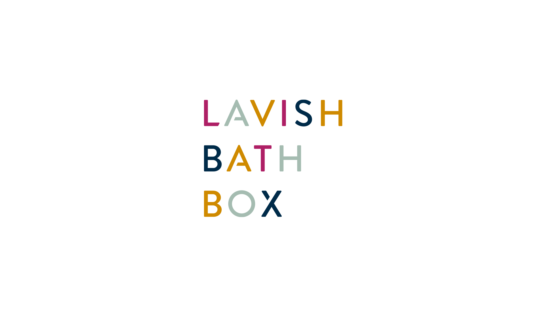
+ VISUAL IDENTITY
+ VERBAL IDENTITY
+ TAGLINE
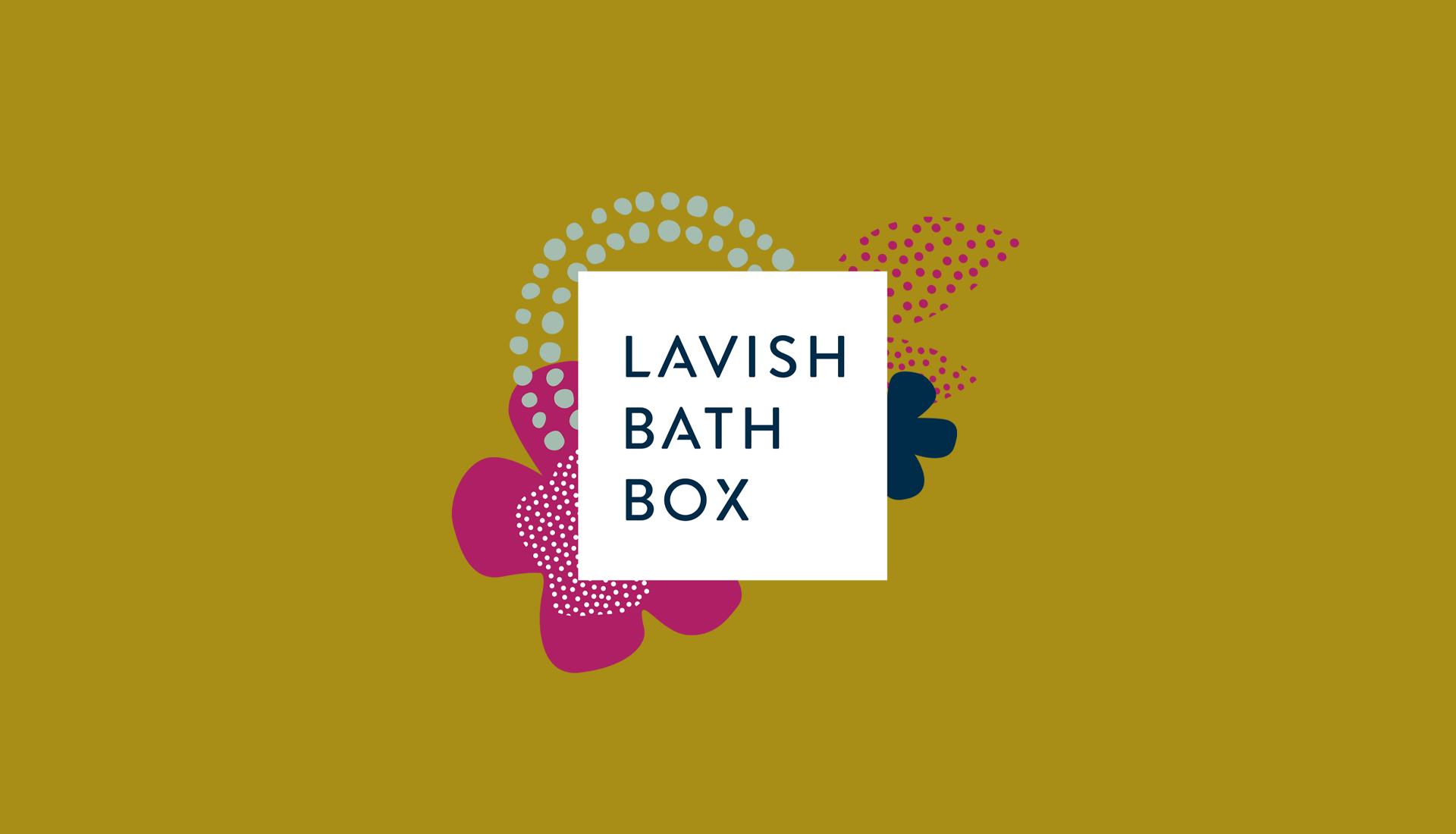
+ COLOR PALETTE
+ CUSTOM GRAPHICS & PATTERNS
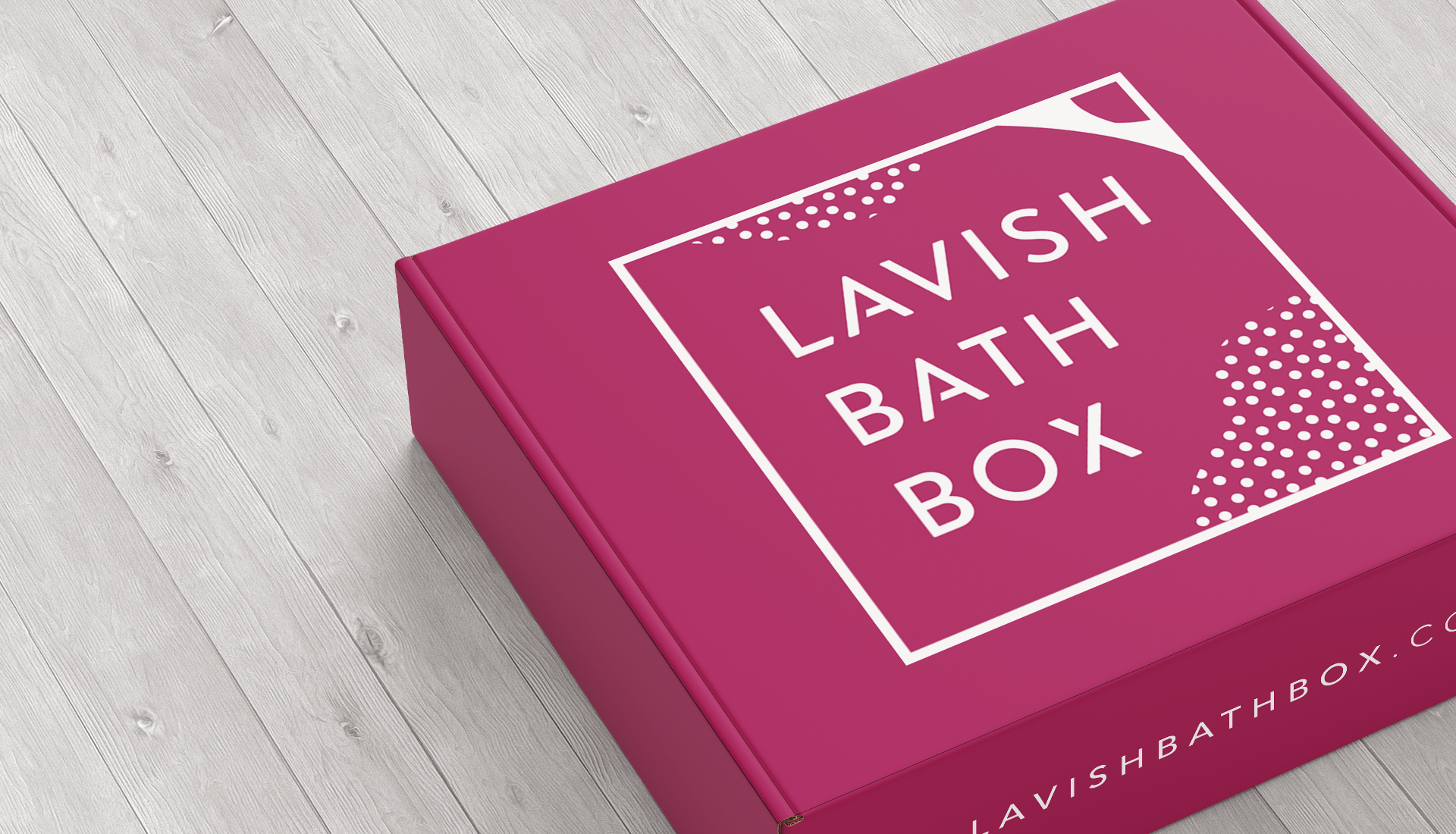
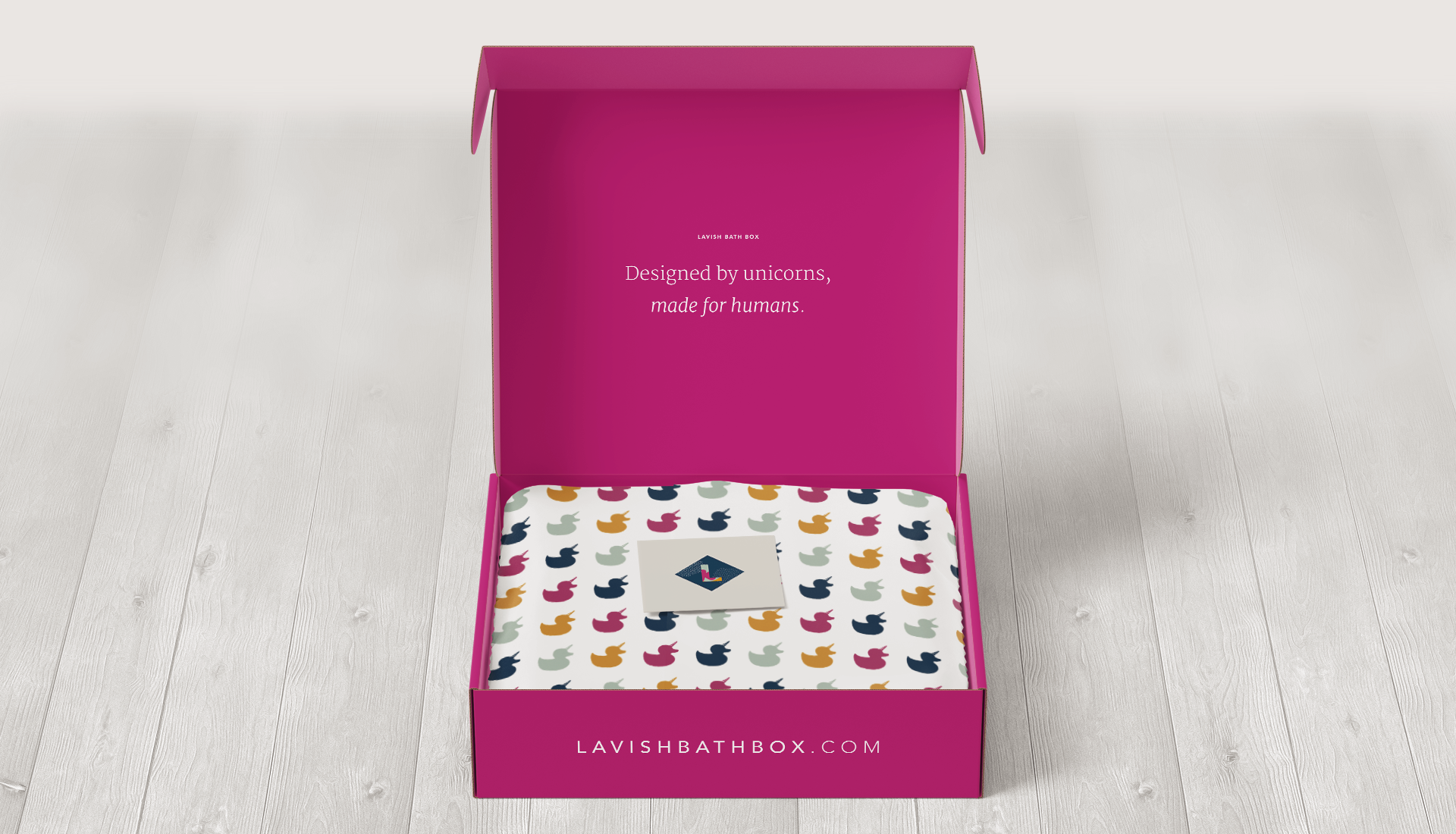
+ PACKAGING DESIGN
+ BRAND TO MARKET
+ BRAND GUIDE

THE PROBLEM
Lavish Bath Box already had a lot going for their brand: loyal and enthusiastic clients, and established, meaningful relationships with their independent and creative contributors. However, Lavish’s founder knew that she had to upgrade the visuals, voice and vibe of Lavish if it was going to represent the sophistication of her evolving business. The level of brand polish expected by her growing customer base as Lavish transitioned from being based completely online to opening their first brick-and-mortar location, was likely to shift dramatically. FV was brought in to elevate and expand every touch point.

OUR APPROACH
Reconsider what it means to be ‘simple’ in this space and look for ways to maintain richness and luxury. Build excitement with language and consistency, build desire with color and texture.
THE WIN
Designed by unicorns, made for humans. Yup, that’s right. The ubercreative, indie bath artists are so unique they deserve an appropriate label. We see them as unicorns because they are rare, special and magical. We created this tag line (or motto, if you will) to not only sum up Lavish founder, Katie, and her team, but also the artisans whose unique, handmade products fill each box. There’s surprise, there’s delight, and each month there will be more.
Contrasting rich color and textures with more subtle references to flowers, leaves, bubbles and shimmer, the brand look delivers a refreshing energy that stands in contrast to the earthy tints of competitors. The brand voice positions Lavish as a co-enthusiast of the products it curates, building a shared excitement that traverses their national distribution with ease.