CPH Insurance Rebrand
A head-turning rebrand for a small, pioneering insurance company who embraces automation, yet maintains the highest levels of personal service and support.
-
+ BRAND STRATEGY
+ BRAND CHARACTER & VOICE
+ TAGLINE
+ LOGO SYSTEM
+ COLOR PALETTE
+ PHOTOGRAPHY STYLE
+ PHOTOGRAPHY DIRECTION
+ PATTERNS & TEXTURES
+ ICON SYSTEM
+ WEBSITE
+ BRAND TO MARKET
2024 Indigo Design Awards Agency Winner
Bronze Winner in Branding: Services




THE PROBLEM
CPH was the first insurer to sell insurance online in the early days of the internet (late 1990s) while maintaining a high standard for customer service. Always attuned to doing more with the same headcount, the company has embraced automation and invested heavily in building an algorithmic platform to manage policies. As the entire world adapted to online interactions, CPH further entrusted their customers to self-serve most needs. The result – clients with the confidence to handle policies on their own, knowing they still have access to top-notch customer care when they need it. Today, they maintain more than 150K customers, with just a handful of staff, while also licensing access to its platform for select insurers.
Their existing brand did not match this level of expertise nor adequately communicate their offering and needed to be reimagined.


OUR APPROACH
Let the system show. For this founder and his team, the digital experience is about enablement, so embrace it. Let’s bend a few traditional rules to let everyone know CPH is different with purpopse.
THE WIN
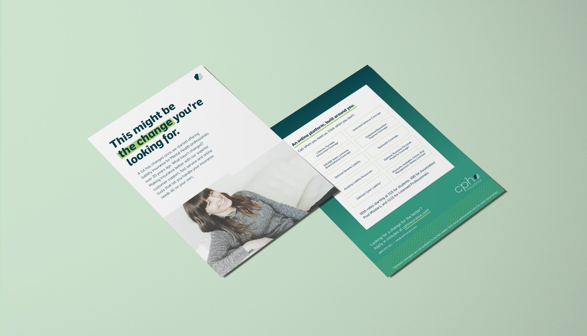
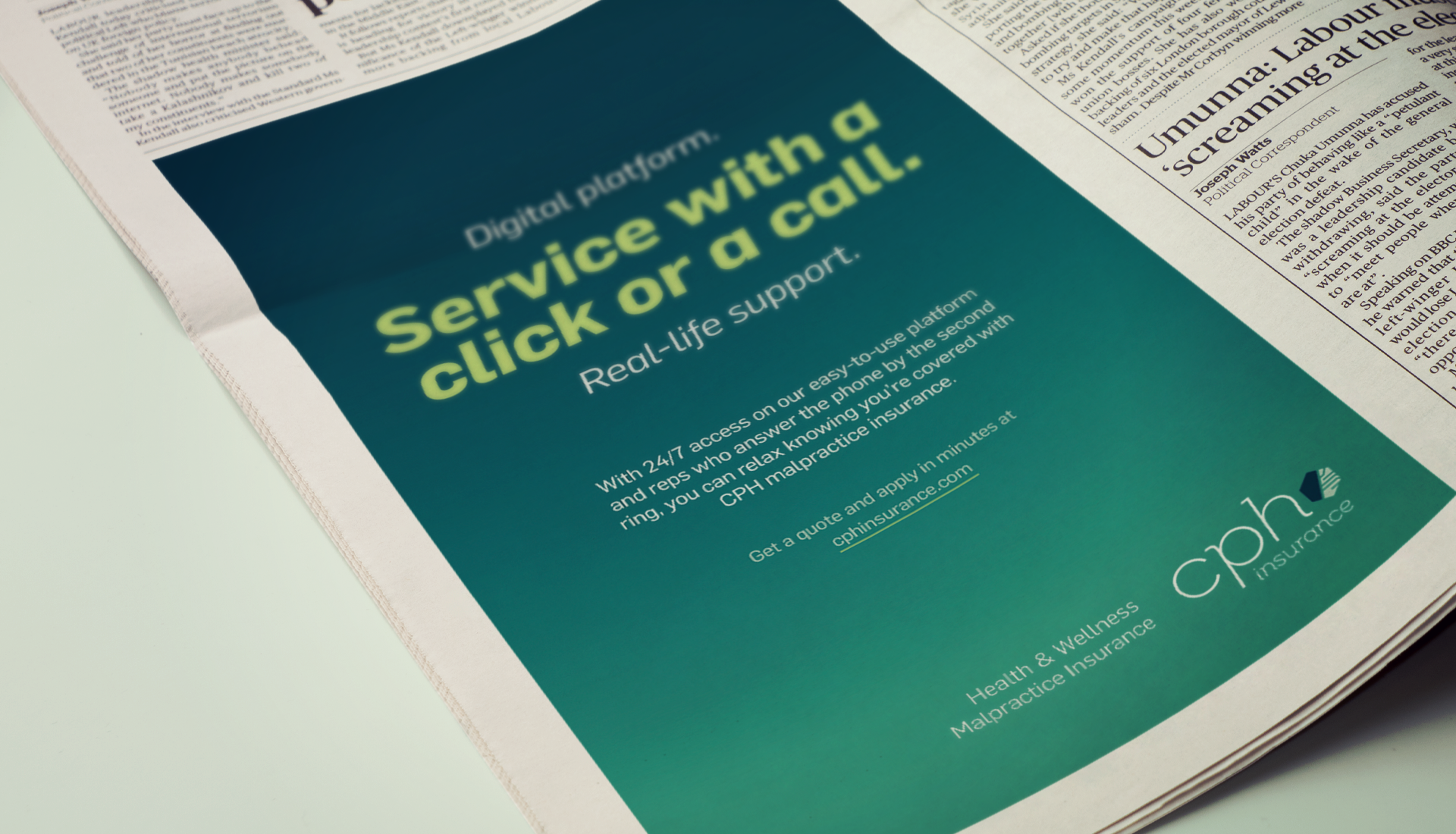
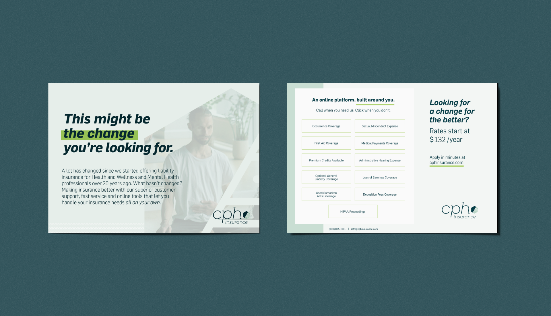
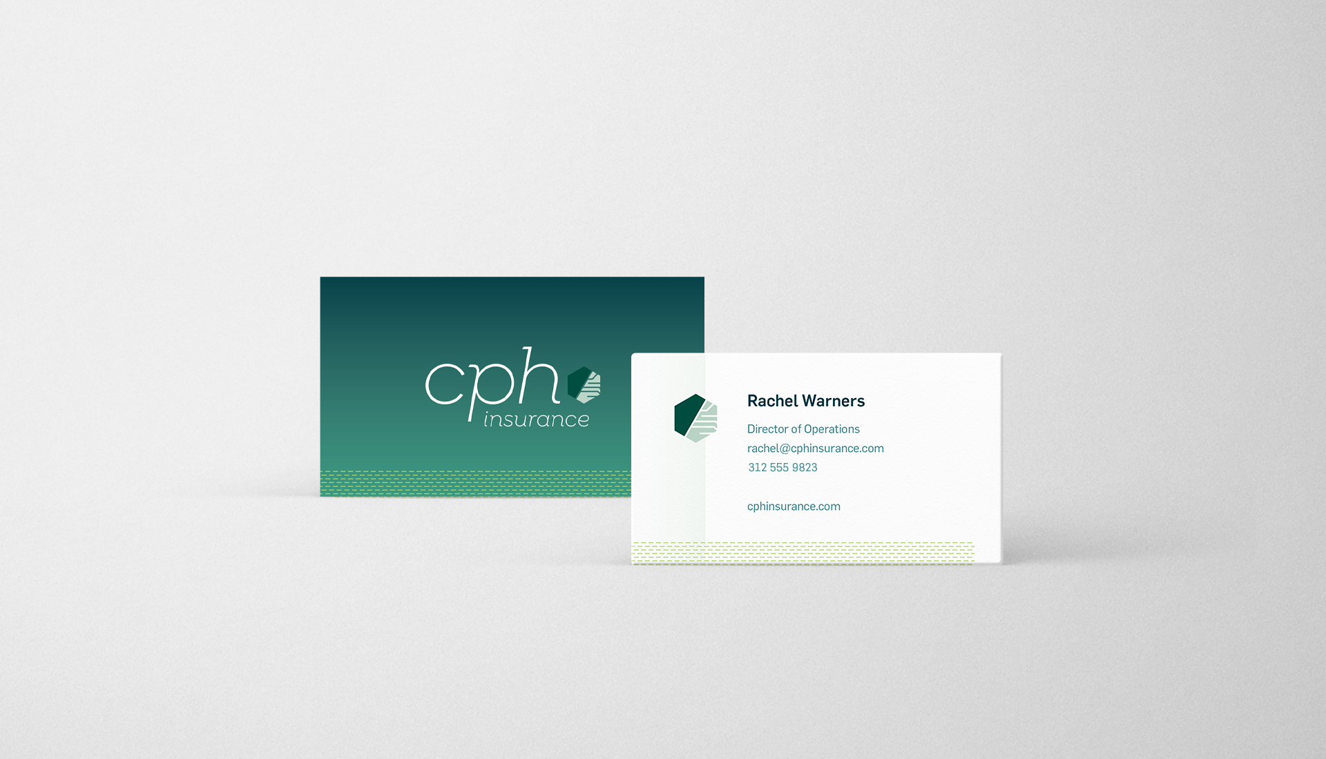
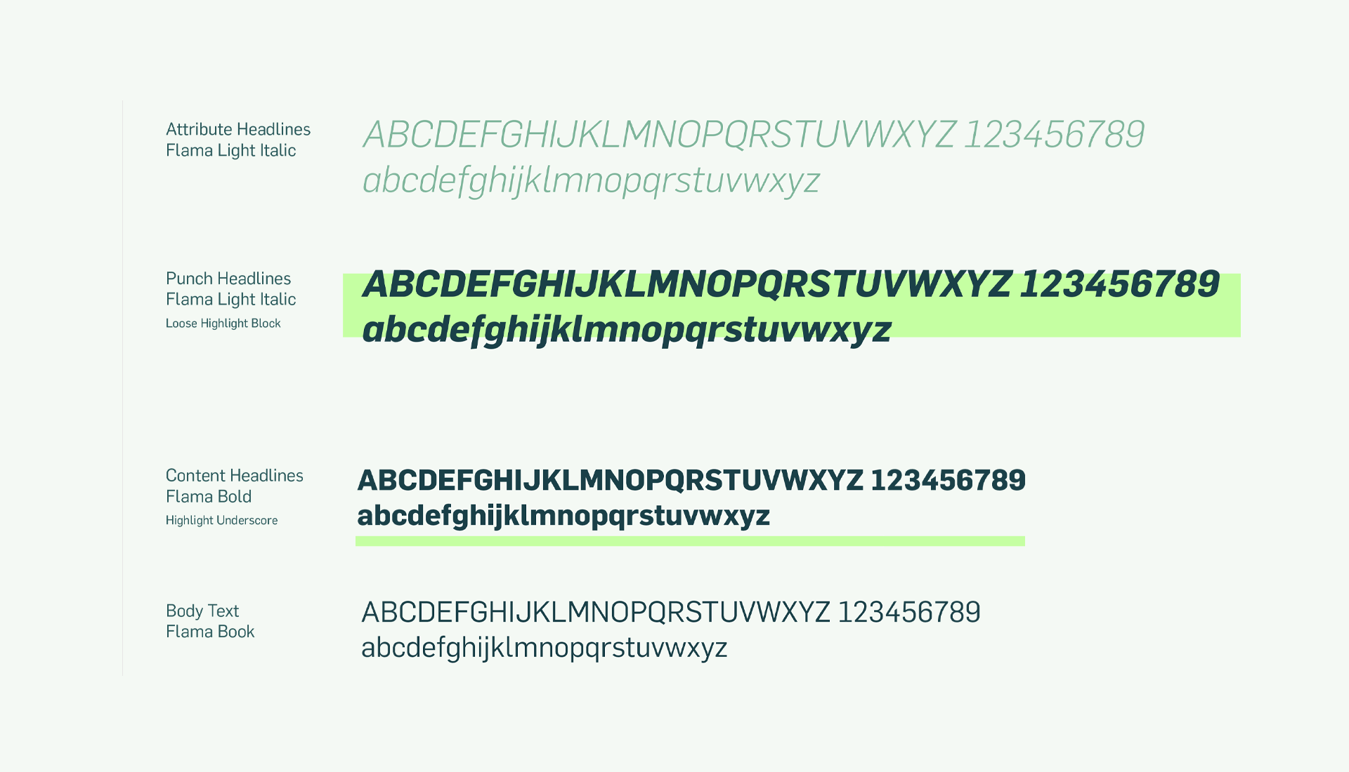
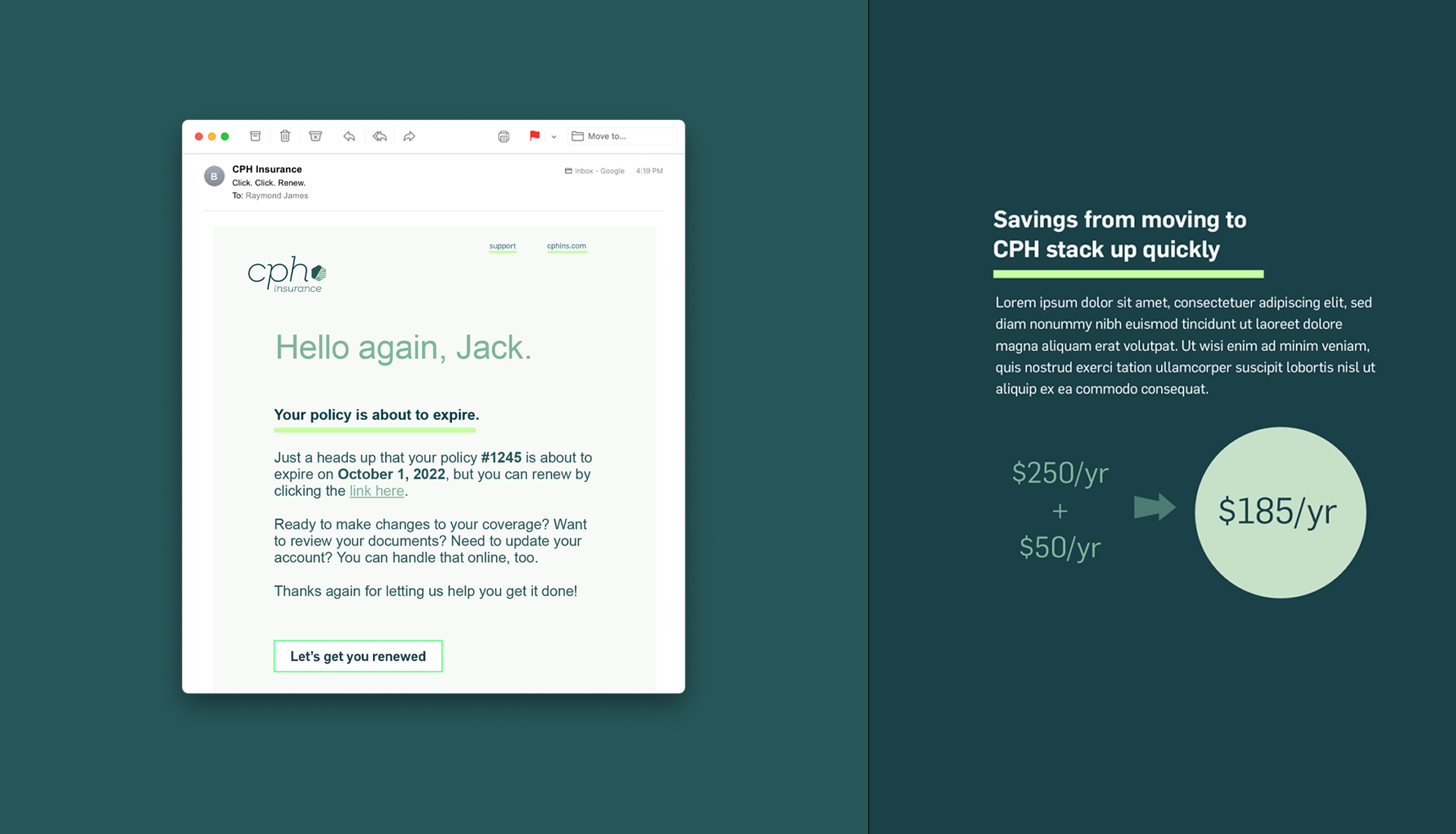
With the company website at the core of operations (sales, service, underwriting and management) FV quickly helped the CPH team step back and realize the great opportunity at hand – updating the overall brand experience while revamping their vast website. Working to get at the core of what motivates the hands-on founder, Phil Hodson, we quickly developed an assertive-yet-dependable brand character to build on. From there, we embraced a number of digital-native visual treatments—from color palette, patterns, shapes and photo styles—to a unique 1-3-2 re-arrangement of headline hierarchy and key message highlighting. The collection of these elements working as a whole reintroduced and further reinforced CPH’s position at every touchpoint of being the insurance company that’s all about putting its policyholders in charge.



Additionally, we provided strategic council on adapting the name “CPH Insurance” to replace “CPH & Associates” as part of a broader SEO/Marketing strategy. Across the board, the result of our engagement was a refreshed sense of focus and a drive to take CPH’s pioneer market position even further.

Rachel Warners, CPH Insurance Director of Operations
“FV has been able to articulate what we’ve struggled to articulate, and they’ve developed exactly what we need to expand our brand. Given that, my advice is to hire them.”

