Fulcrum Consulting Group Rebrand
Multiplying the collaborative mindset by the attention to detail of this private equity consulting firm results in a powerful brand ready to seize the future.
-
+ BRAND POSITIONING
+ VISUAL IDENTITY
+ MESSAGING & VOICE
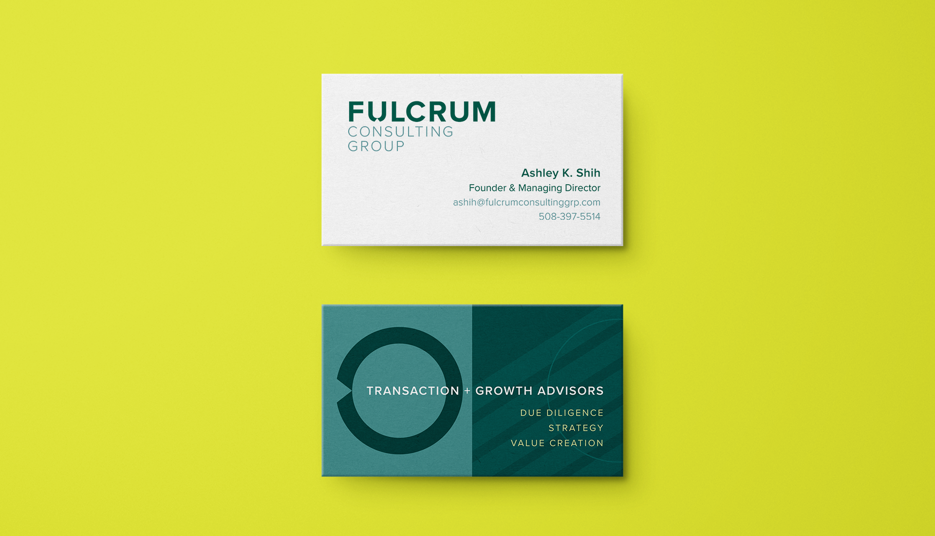
+ LOGO SYSTEM
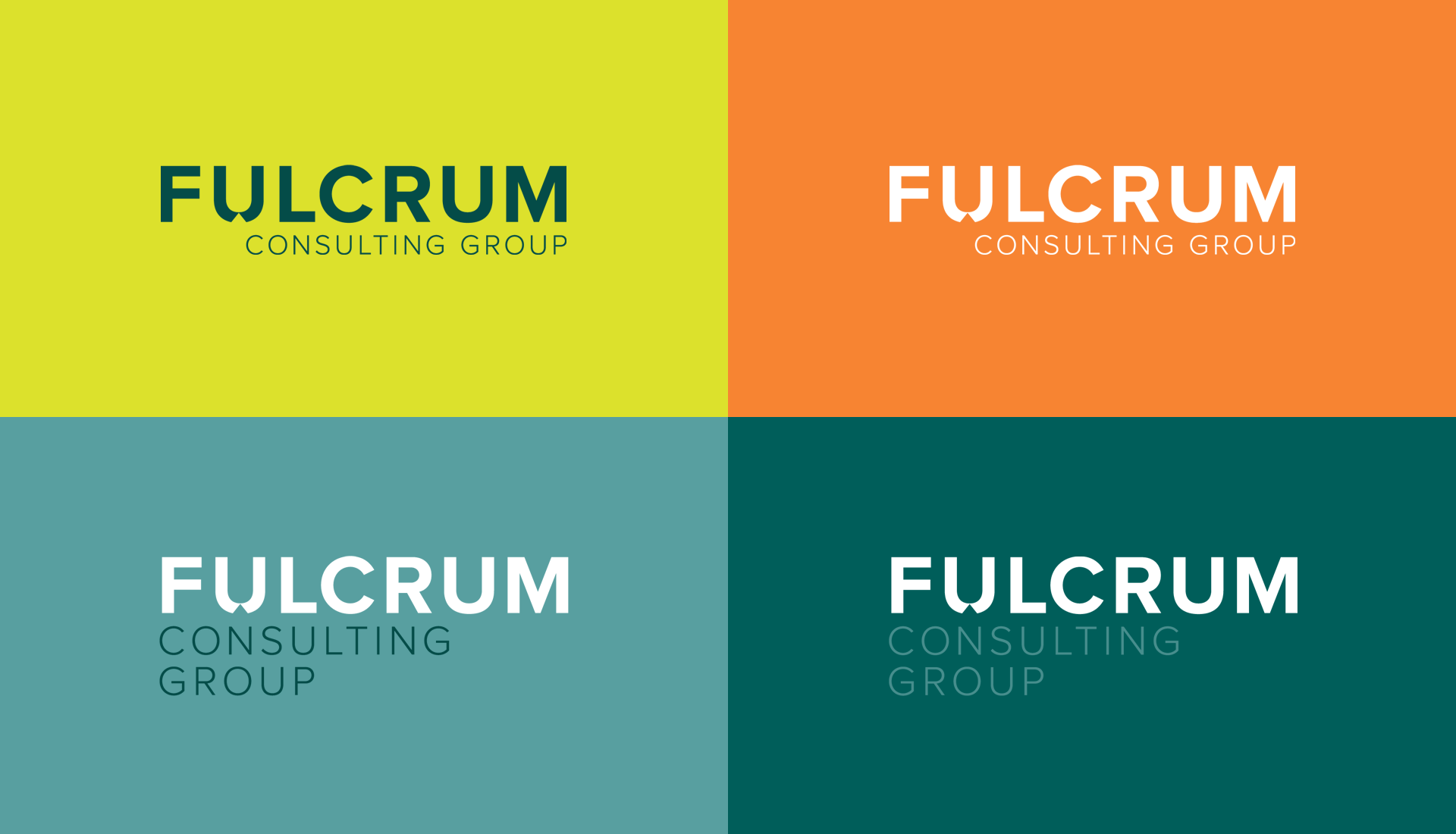
+ COLOR PALETTE
+ TYPOGRAPHY DIRECTION
+ PHOTOGRAPHY DIRECTION
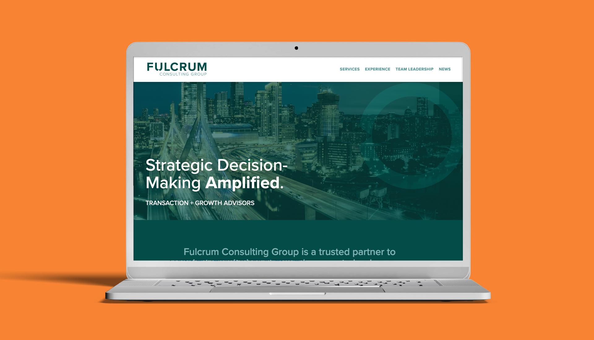
+ WEBSITE
+ BRAND-TO-MARKET
THE PROBLEM
It’s not immediately apparent, but consulting is an incredibly simple idea. One party advising another on a subject they carry expertise or experience in, creating an amplified advantage—leverage. Fulcrum has always done this well, but they needed to generate some leverage of their own to expand. That’s where we beome a force multiplier ourselves.
OUR APPROACH
Convey on many levels that there is something more modern here, while maintaining a high level of sophistication and infusing everything with an underlying sense of intelligence at work.
THE WIN
Working from the engagement strategy that the two Fulcrum founders had in mind, we arrived at a detailed positioning that would give the team the flexibility to hire and grow into a breadth of situations as the expert leverage Private Equity firms seek when amplifying profits through complex acquisitions, operational streamlining and eventually a sale.
When it was time to get into a visual exploration, we sought out ways to portray this pivot point in a subtle way, giving the logotype distinction and visual force. The color palette packs a sense of calm, intelligent perfection with bursts of brilliant intensity. Visual support through graphics carrying arcs, points and angles work with photography that firmly provides the context.