Henny+Roo Rebrand
Uncovering the fun and beauty of a subscription box that celebrates the joyous and strange universe of chicken keeping.
-
+ BRAND FOUNDATION
+ VISION, MISSION, VALUES
+ BRAND CHARACTERISTICS
+ VISUAL IDENTITY
+ VERBAL IDENTITY
+ TAGLINE
+ COLOR PALETTE
+ CUSTOM GRAPHICS & PATTERNS
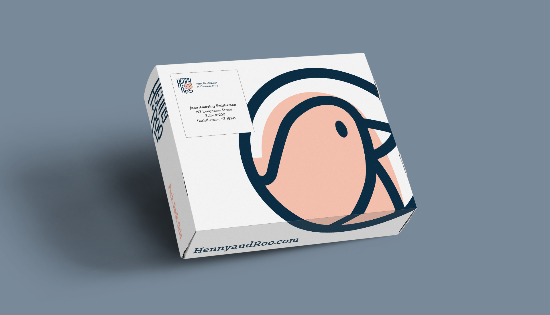
+ PACKAGING DESIGN
+ BRAND TO MARKET
+ BRAND GUIDE

THE PROBLEM
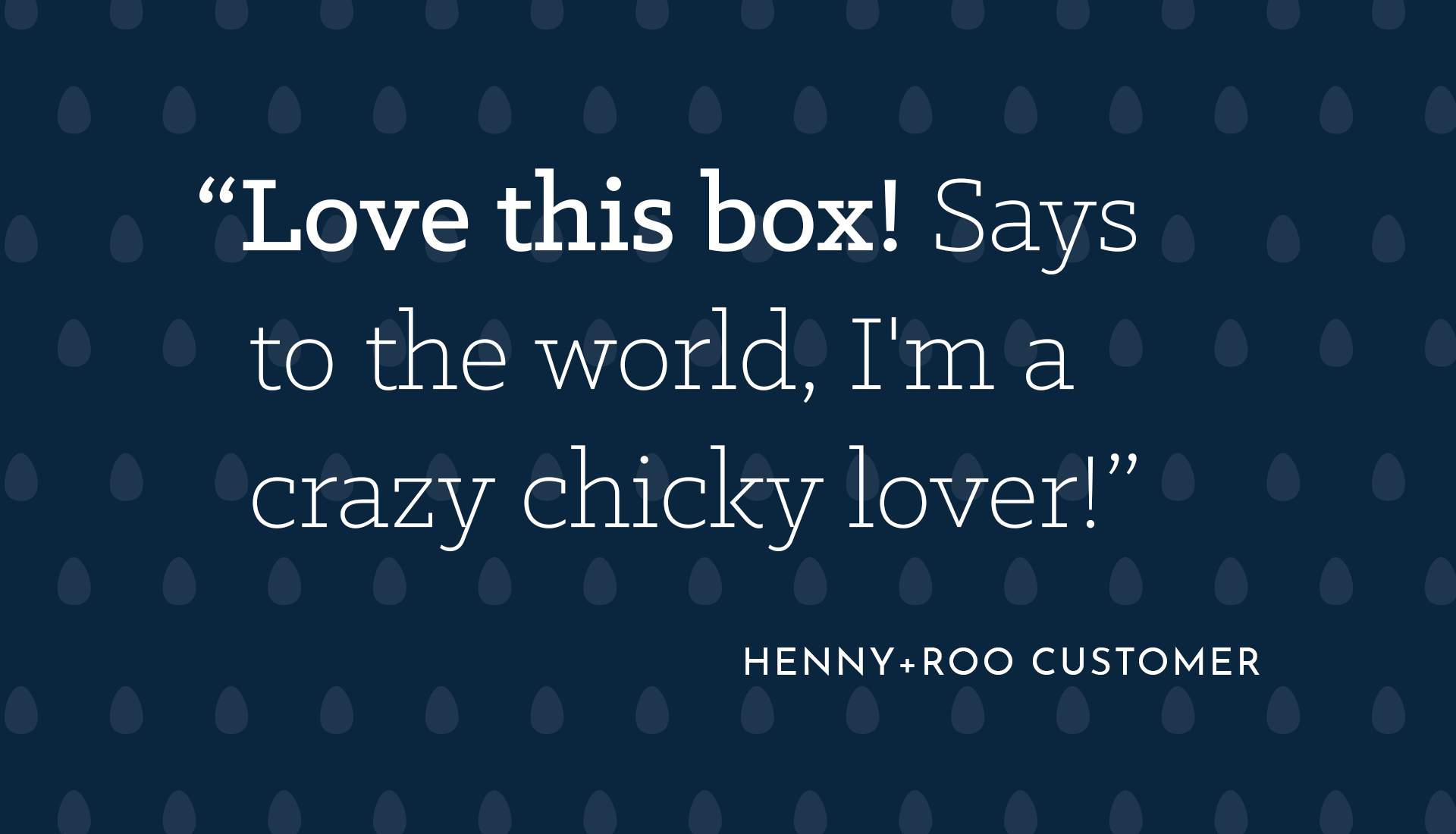
Being the only monthly subscription box for chickens (and their keepers) Henny+Roo needed a brand developed that would help them confidently establish themselves within their growing community of chicken enthusiasts and backyard chicken keepers. As an already energetic and joyful business, the company needed the visuals and voice to match, as it had flew past all growth projections.
OUR APPROACH
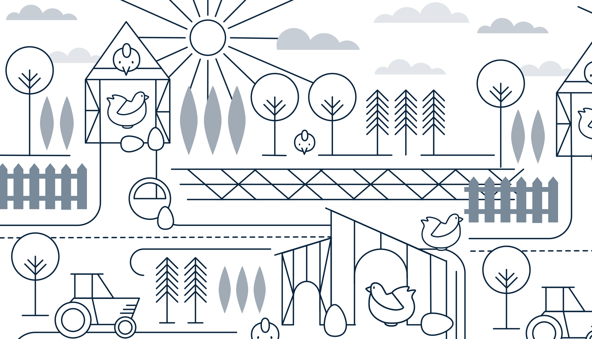
Keep it simple, and keep it fun through illustration and snappy one liners. The look can nod to good ol’ farm life, but should feel comfortable landing on the stoop of a mid-century modern home…that naturally has a coop out back.
THE WIN
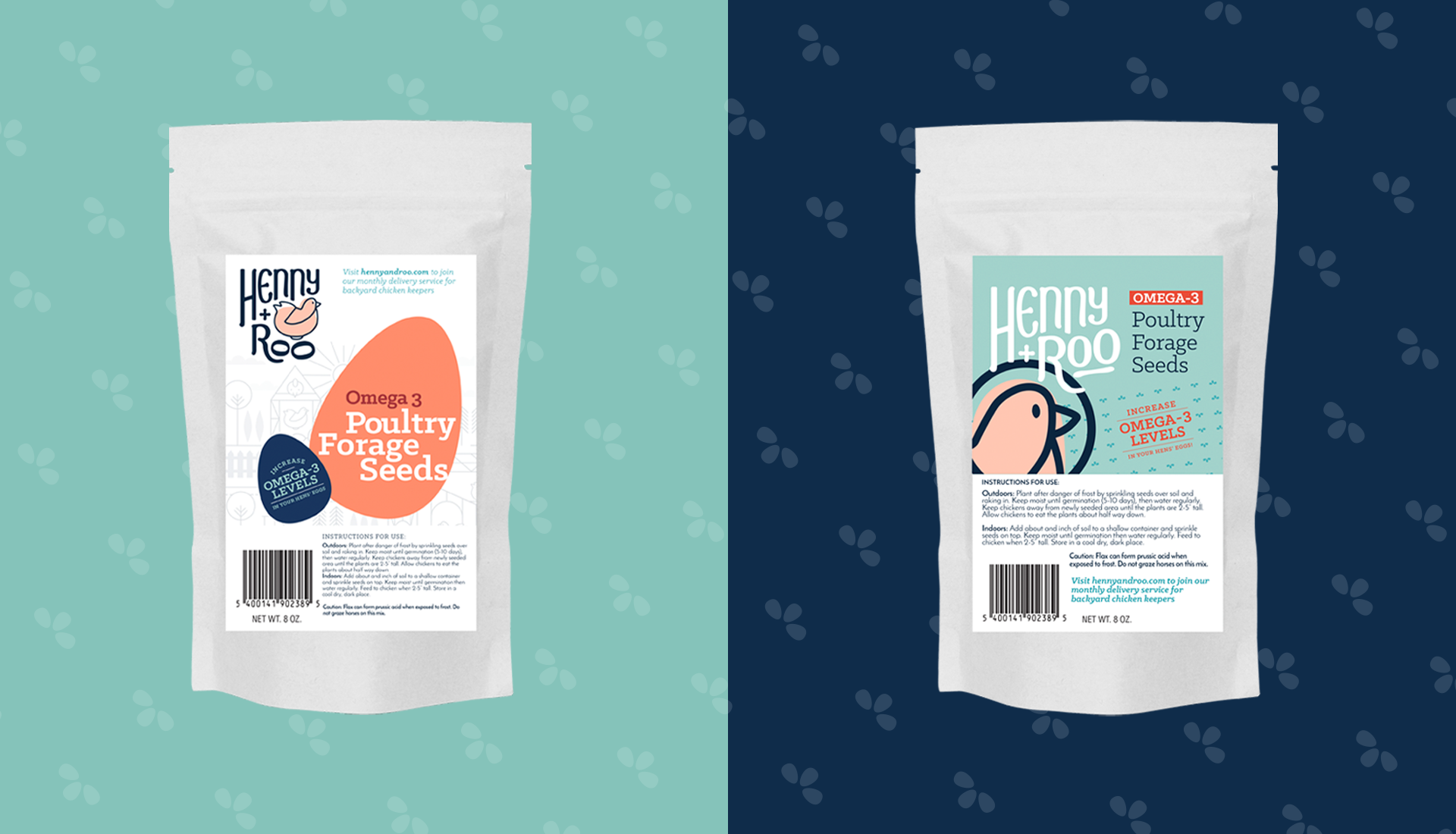
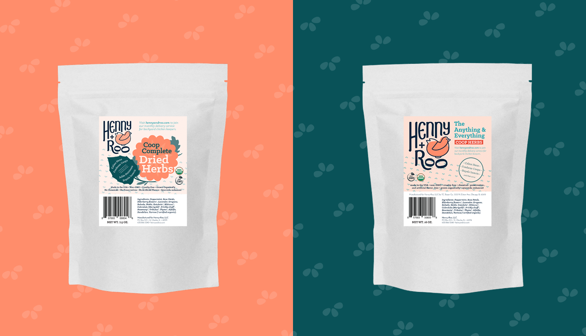
Helping to recognize and celebrate their position in the market, we drew from a combination of folk and country styles (and then amped things up a bit) creating graphics and color palettes with contextual connection to life on the American farm. With a passion for high-quality, natural products, Henny+Roo went one step beyond curating a box full of goodies and made their own line of products for their subscribers. By applying the new and expansive visual identity to each product, we not only created a fun, energetic and cohesive suite of products, but we also found a way to further communicate the playful spirit of Henny+Roo, ensuring the loyal following they build will share in the enthusiasm.