The Spruced Space
A home organization company moves beyond reorganizing and removing clutter, to offer storage solutions designed around each client’s unique space.
-
+ BRAND STRATEGY
+ BRAND CHARACTER & VOICE
+ TAGLINE(S)
+ LOGO SYSTEM
+ COLOR PALETTE
+ PHOTOGRAPHY STYLE
+ PHOTOGRAPHY DIRECTION
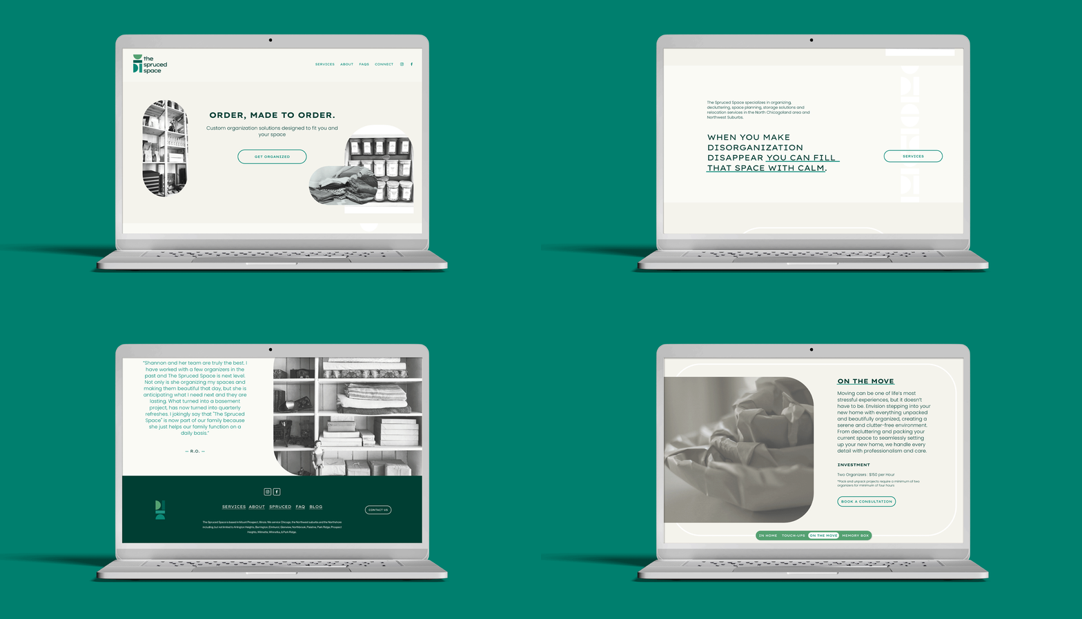
+ WEBSITE

THE PROBLEM
For over 5 years, The Spruced Space had been helping homeowners and businesses in Chicagoland create calm in their space with a tailored approach to organizing. Realizing there was more potential, and more profit in this business to be had, Shannon – the founder and owner – widened her view towards growth. We recognized that establishing and strengthening the brand positioning was needed. After a number of conversations, it was determined that a strategic rebrand that sets The Spruced Space apart from its competitors and gives customers an idea of what they’ll experience when using them was ultimately going to drive the kind of change being sought.

OUR APPROACH
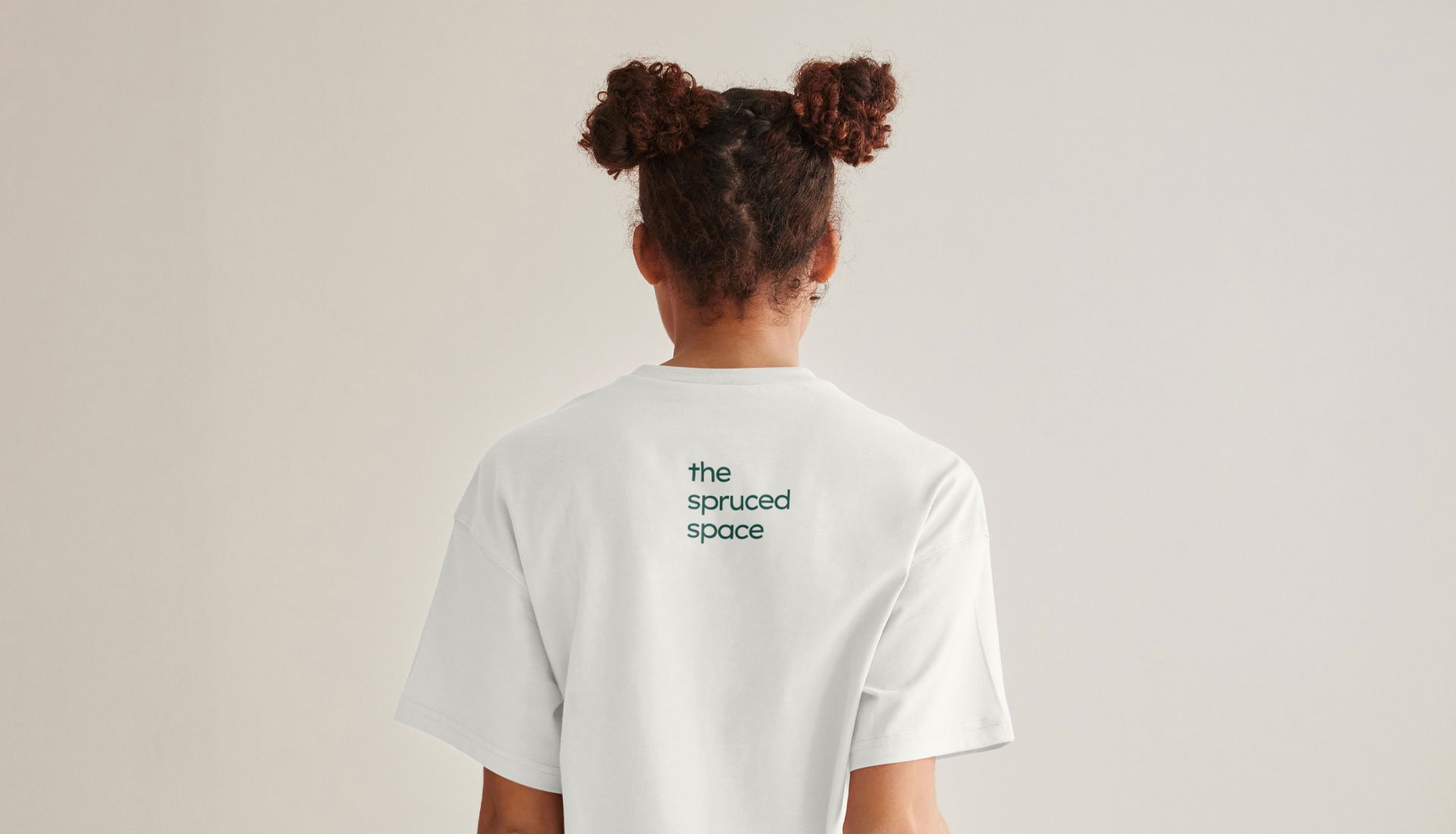
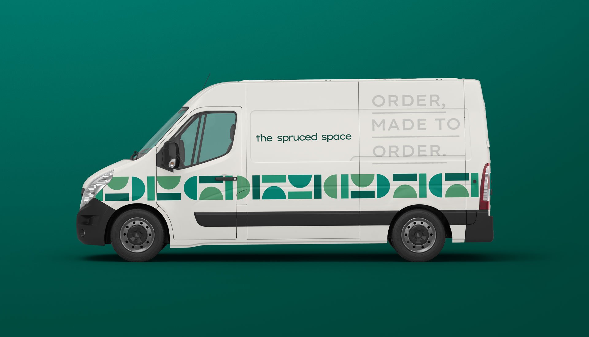
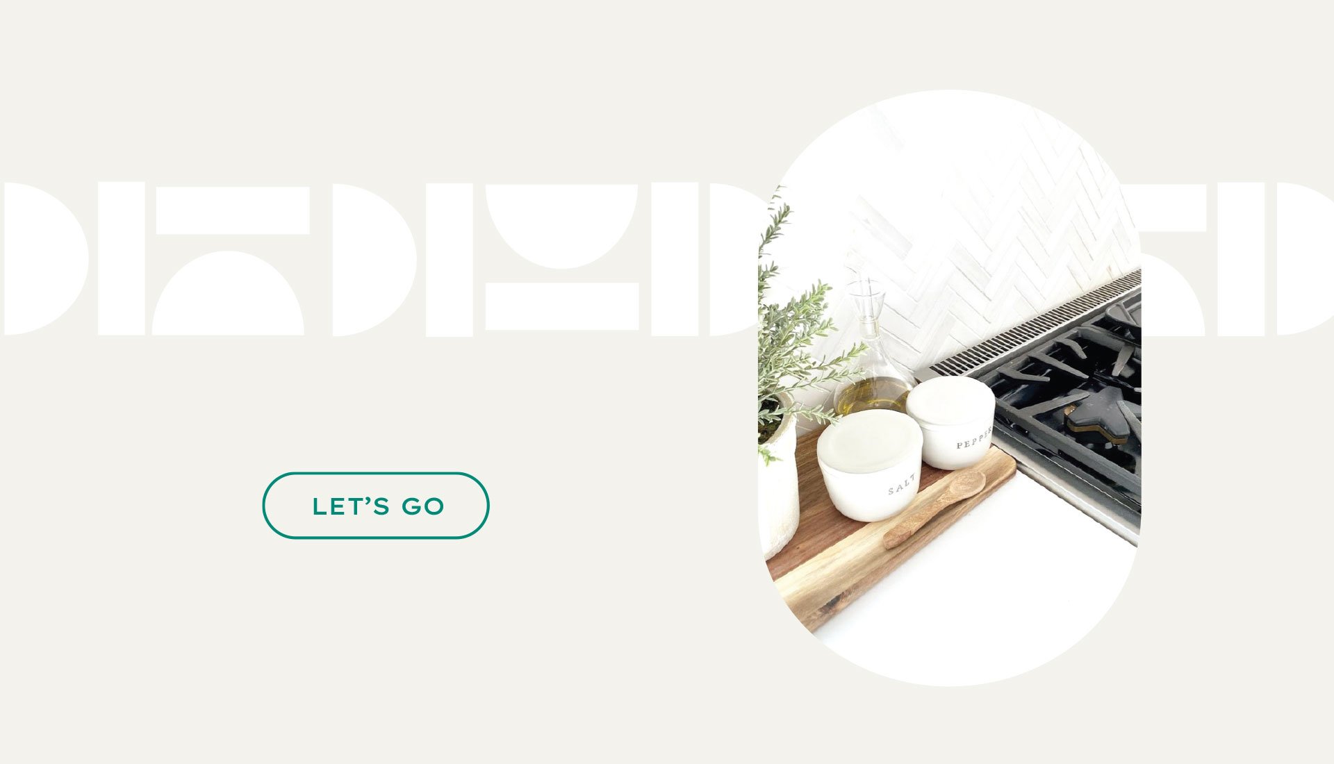
Go against the grain of the expected black, white and gray aesthetic commonly seen from competitors, while making sure not to stray so far that the brand’s relaxing and calming benefits were lost in the visual approach. Pushing the brand’s language and visual expression using colorful, bold shapes created a rich, yet clean palette that communicates their high-quality services. The final touch was the logo icon, which is a deconstructed representation of the letters, T S S, perfectly reorganized – proving the brand’s unique, tailored approach to reorganizing a space in endless ways.
THE WIN
Communicate a differentiated approach in a market saturated with less-sophisticated, less-serious competitors. Shannon was extremely happy with how we captured the vision she had been working toward, and the newly defined and showcased company services and skills. Standing out, and standing for a defined perspective will support her team's growth and expansion for years to come.


Brand Guide
One of the more important elements we created and handed off to The Spruced Space was an online brand guide. Not only does this give the team access to downloadable assets for use with collateral, promotional items and uniforms, it ensures that the brand will be used correctly and consistently by vendors.


